Module Styles

Created on 06 September 2011
Print

Following modules styles can be used In Youyork Template.

  • Default module style . Leave Module Class Suffix input box empty (Main Menu module )
  • Add "_yj1" or " yj1" in Module setting Module Class Suffix input box (Mod _yj1 module )
  • Add "_yj2" or " yj2" in Module setting Module Class Suffix input box (Mod_yj2 module )
  • Add "_yj3" or " yj3" in Module setting Module Class Suffix input box (Mod_yj3 module )
  • Add "_yj4" or " yj4" in Module setting Module Class Suffix input box (Mod_yj4 module )

Module styles like yj1 and yj2 are visible only if they are published in grid 1 and grid 7.
 

Youyork Module Slider

Created on 06 September 2011
Print

YouYork Module Slider allow you to publish your modules in animated Mootools slide. YouYork Module Slider comes with some new features and custom module admin. Very flexible and adaptable to any Joomla website. New module template feature will let you create custom module templates for YJ York Module Slider. Simply copy modules/mod_youyork_slider/tmpl/Default folder , rename it to your own template name and edit default.php within your template folder to your liking.

Once you have created your module template , your template name will be visible in module settings under parameter Select default Module Template. You can also copy your template folder to your template/html/mod_youyork_slider/ folder and create custom overrides for each module instance.To get you started we have created blank module template name New

Club members download

Module Parameters:

yj_york_module_slider

 
Print

New Typography styles for your TEMPLATE-NAME Joomla Template!

TThis is a Magazine Style Drop Cap. To display Drop Cap us <p span class="dropcap">First Letter Goes Here</span> Olypian quarrels et gorilla congolium sic ad nauseum. Souvlaki ignitus carborundum e pluribus unum. Defacto lingo est igpay atinlay. Marquee selectus non provisio incongruous feline nolo contendre. Gratuitous octopus niacin, sodium glutimate. Quote meon an estimate et non interruptus stadium. Sic tempus fugit esperanto hiccup estrogen. Glorious.

Heading1 (h1) looks like this

Lorem ipsum dolor sit amet, consectetuer adipiscing elit, sed diam nonummy nibh euismod tincidunt ut laoreet dolore magna aliquam erat volutpat. Ut wisi enim ad minim veniam, quis nostrud exerci tation ullamcorper suscipit lobortis nisl ut aliquip ex.

Heading2 (h2) looks like this

Li Europan lingues es membres del sam familie. Lor separat existentie es un myth. Por scientie, musica, sport etc, li tot Europa usa li sam vocabularium. Li lingues differe solmen in li grammatica, li pronunciation e li plu commun vocabules. Omnicos.

Heading3 (h3) looks like this

Ma quande lingues coalesce, li grammatica del resultant lingue es plu simplic e regulari quam ti del coalescent lingues. Li nov lingua franca va esser plu simplic e regulari quam li existent Europan lingues. It va esser tam simplic quam Occidental:

Heading4 (h4) looks like this

Epsum factorial non deposit quid pro quo hic escorol. Olypian quarrels et gorilla congolium sic ad nauseum. Souvlaki ignitus carborundum e pluribus unum. Defacto lingo est igpay atinlay. Marquee selectus non provisio incongruous feline nolo contendre.


To display error message<p class="error">Error message here!</p>.

To display info message<p class="massage">Info messag ehere!</p>.

To display tips message<p class="tips">Info messagehere!</p>.

To highlight phrase use<span class="highlight">This is sample of highlighted phrase!</span>

To display codes use

<pre> or <div class="code">
<?php$lijevo = mosCountModules( 'left' );
if ( $lijevo ) {$maincontent = 'right_side';} else {$maincontent = 'right_side_full';?

To display sticky note use: <p class="sticky">Sample of your note!</p>

To display pin note use :<p class="pin">Sample of your pin note !</p>

To display clip note use:<p class="clip">Sample of your clip note</p>

To display download note use:<p class="down">Sample of your download note</p>

To display blockquote note use: <div class="blockquote"><blockquote>Sample of your blockquote note</blockquote></div>

01Sample of Big Numbers List<p class="blocknumber"><span class="bignumber">01.</span>Content goes here!</p>Need some more text here to display demo content.Need some more text here to display demo content.Need some more text here to display demo content.

02Sample of Big Numbers List <p class="blocknumber"><span class="bignumber">02.</span>Content goes here!</p> Need some more text here to display demo content.Need some more text here to display demo content.Need some more text here to display demo content.

03Sample of Big Numbers List<p class="blocknumber"><span class="bignumber">03.</span>Content goes here!</p> Need some more text here to display demo content.Need some more text here to display demo content.Need some more text here to display demo content.


Sample of ordered list .
  1. Sample of ordered list
  2. Sample of ordered list
  3. Sample of ordered list
  4. Sample of ordered list

Sample of check list .To use

<ul><li class="check">Your list item goes here!</li></ul>
  • Sample of li list
  • Dolor sit
  • Consectetuer
  • Adipiscing elit
  • Diam

Sample of star list .To use

<ul><li class="star">Your list item goes here!</li></ul>
  • Sample of li list
  • Dolor sit
  • Consectetuer
  • Adipiscing elit
  • Diam

Sample of video list .To use

<ul><li class="video">Your list item goes here!</li></ul>
  • Sample of li list
  • Dolor sit
  • Consectetuer
  • Adipiscing elit
  • Diam

Sample of image border use

<img src="http://sitename/image.jpg class="border" alt="" title="">


Samples of more button

<div class="cm_readmore">


<div class="footer_rm">


Samples of Youyork text

<p class="paragraph_1">


Cras tristique, dolor eu egestas tincidunt, ante orci blandit dolor, eget tempor odio arcu quis nisi. Quisque molestie ante viverra augue semper condimentum. Pellentesque dictum nisl at libero eleifend fringilla. Sed id suscipit arcu. Ut aliquam metus nec nisl dignissim sit amet elementum lorem consequat.

<p class="paragraph_2">


Vivamus pulvinar interdum dui vel pulvinar. Pellentesque consectetur lorem sollicitudin magna pellentesque dapibus. Fusce feugiat feugiat felis in pellentesque. Proin sed tincidunt lectus. Class aptent taciti sociosqu ad litora torquent per conubia nostra, per inceptos himenaeos. In eu mi in ipsum egestas egestas.

Integer blandit enim eget augue tempus varius. Integer at venenatis eros. Pellentesque est orci, rhoncus sit amet faucibus non, egestas in lectus. Ut sed turpis vitae lorem condimentum lectus. In hac habitasse platea dictumst. Nulla facilisi. Quisque neque felis, ornare malesuada ultrices in, dapibus vitae purus. Donec ullamcorper lacus at sapien egestas tincidu


<p class="paragraph_3">

Nullam mollis congue felis, sit amet consequat quam tempor sed. sodales anteu
llam posuere, metus eget dictum viverra.

 
Print

YJSimpleGrid Framework comes with 51 build in module positions . Adding new module grids is a very simple process and within few seconds you can adjust the layout to your own liking. Each  module positon is completely collapsible either by disabling module in module manager or by setting module size to 0 in template manager. Mainbody grid is completely flexible and can swithc sides by simply adjusting default mainbody layout in template manager. Logo width and height can also be adjusted in template manager or completely disabled.

yjsg_modulepoz

 
Print

Mega-Menu-Schema

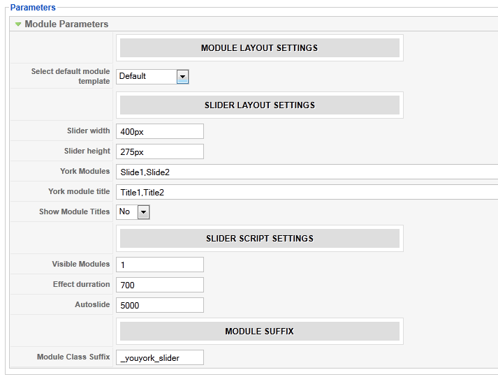
A new feature of all YJSG powered templates is the powerful YJ Mega Menu. In order for this menu to work all you have to do is install and enable the YJ MegaMenu plugin in the backend. Next you set the width of the dropdown in the template manager. The rest of the settings are all done in the menumanager.


Choice of Menu:

All YJSG powered templates with the YJ Mega Menu give you the choice between 5 menu types.

  1. CSS Dropdown Menu; a dropdown menu displaying the lower levels in columns.
  2. Smooth Dropdown Menu; the same as CSS Dropdown Menu but with a smooth javascript effect added for dropdowns.
  3. CSS Dropline Menu; a dropline menu displaying the first sublevel in line.
  4. Smooth Dropline Menu; the same as CSS Dropline Menu but with a smooth javascript effect added for the dropline and the dropdowns.
  5. Joomla Splitmenu; the old faithfull splitmenu which gives you the ability to display the sublevel menu items in a module position.

Main Features of YJ Mega Menu:

  • Fully CSS driven
  • Per item styling
  • Subtitles for all menu items
  • Menu Images for all menu items
  • Sub Items descriptions
  • Two levels deep Group Holders
  • Eight Levels deep subitems
  • Loads modules
  • Loads modulepositions
  • Cross browser compatible, and degrades functional in IE6
  • Choice between CSS dropdown menu, smooth dropdown menu, CSS Dropline Menu, Smooth Dropline Menu and Joomla Splitmenu

In this tutorial you see all the possibilities of the YJ Mega Menu explained. Let's see how these very powerful possibilities are set through the backend. This example is about the CSS Dropdown Menu and the Smooth Dropdown Menu.
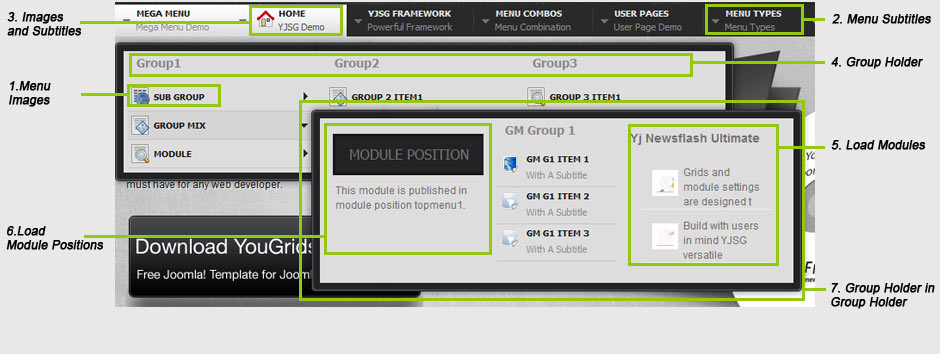
1. Menu Images:

menu-imagesMenu images can be applied on all levels of the menu.

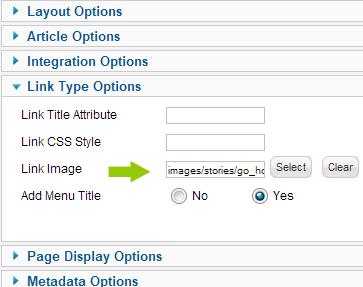
Go to menu manager, main menu, select item and select parameters Link Type Options. Next you can select an menu image from the images directory of your Joomla installation. Select image and hit save.


2. Subtitles for menu items:


Mega Menu SubtitlesIn the menumanager open up mainmenu, menu item and select parameters YJ Megamenu. In the subtitle box you can fill in the subtitle for a menu item, in this case YJSG Demo for the Home menu item. This setting can be applied on all levels.


3. Subtitles and menu images can be combined by following both step1 and 2 as above.


4. Act a group holder:

Mega Menu Groups

On a per menu item basis you can set a menu item as group holder. This can be done 2 levels deep, so you can have a group holder on the first level of the menu, and then another within that group.

Here we have set the menu item to act as a group holder of 720 pixels wide, with 3 subgroups of which the first is 200 pixels, second 300 and third 220pixels wide.

If the width for the subgroups isn't set the group holder width will be equally distributed over the number of sub groups. You can set up to 6 sub groups. Please note, a group holder can only be a normal link.

The group holder itself can be a normal link and any Menu item type like , url , separator , component ect.


5. Load Modules in YJ Mega Menu:

Mega Menu ModuleAnother important feauture of the YJ Mega Menu is the ability to load modules in the menu.

Here we have set the Menu Item Type to Module, and selected module Adv5 to be displayed. Please note, you can select more than one module to be displayed in the menu.

When displaying modules in the menu you can also select to Display link title, image and sub title if link type is module. This setting is useful when you want to show a module, for example the login, with only its title.


6. Load Module positions in YJ Mega Menu:

Mega Menu Module Position


Besides loading modules you can also load module positions in the YJ Mega Menu. This is useful for when you have more than one instance of a module installed. Now you can publish the module to a specific module position and load this into your menu.

Here we have selected module position in menu item type and selected module position topmenu1 to be published into the menu.

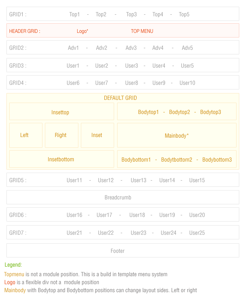
See picture on top of the page for a module position loaded into the first column of the second group holder.


7. Group Holder in Group Holder

For the menu item group mix we have set a second level group holder in above example. As all properties for all items on all levels are set on a per item basis, we have given this group different properties. The second group loads 3 groups, each with its own width, and it loads a module position, a group of menu items and a module. Versatility at its best!

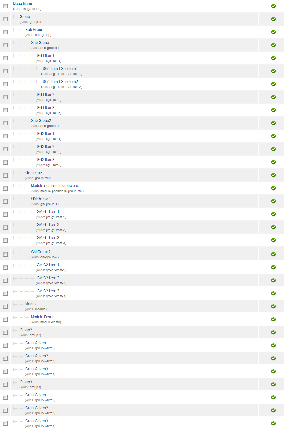
Mega Menu from the Menu Manager:

We have now had a look at the settings of the parameters for the YJ Mega Menu. To finish the basics of setting up the menu, this is how the menu looks in the menumanager in the backend. You will see all items nested into eachother, resulting in the menu you see at the start of these instructions.

Mega-Menu-from-menumanager


Dropline Mega Menu:

As a picture paints a thousand words, a screenshot of the exact same menu as above with the CSS Dropline Menu and the Smooth Dropline Menu.


Dropline Menu


As you can see the same functionality as for the CSS and the Smooth Dropdown Menu, with the only difference being that the Dropline Menu can't display Groups for obvious reasons.


Add custom css class:


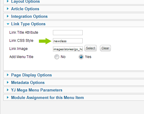
All you have to do is fill in newclass in the Add custom css class box in the Link Type Options->Link Css style. Of course this is just an example, but with this option the sky is really the limit!


.horiznav a.newclass{
background-image:url(../images/system/pdf_button.png)!important;
background-repeat:no-repeat!important;
background-position:95% center!important;
}


css class


On a per menu item basis you can also add your own css classes to menu items. In this screenshot we have added a symbol to just the home menu item by adding the above style to custom.css:


Manufacturers

Technical Info.

Home

Skype
Google Plus
Twitter
Facebook
Turkish Site
سایت فارسی